Get your own beautiful samples here. | Image: courtesy of DesignShop
As spring melts into summer, a renewed sense of possibility fills the air—and often, our homes. This seasonal transition offers the perfect opportunity to refresh our living spaces, transforming them from winter’s cocoon into vibrant environments that celebrate warmth, light, and renewed energy. Whether you’re considering a quiet reading nook, brightening your kitchen, or planning a bold exterior makeover, now is the time to rethink how you can make the most of color, light, and purpose to create spaces that feel as good as they look. Design expert Barbara Jacobs presents key points of advice to consider as we enter the summer season.
Understanding Your Space's True Function
Before reaching for that paint brush, take a moment to consider the real function and feel of each room. Are you working from home in a space that feels too dim and uninspiring? Do you find yourself gathering with friends in areas that lack warmth and connection? Perhaps you’re trying to relax in a bedroom that feels unexpectedly flat and lifeless. Color has the remarkable ability to shift all of these experiences, but the key lies in understanding what each space truly needs.

Get your own beautiful samples here. | FollowTheFlow/Shutterstock.com
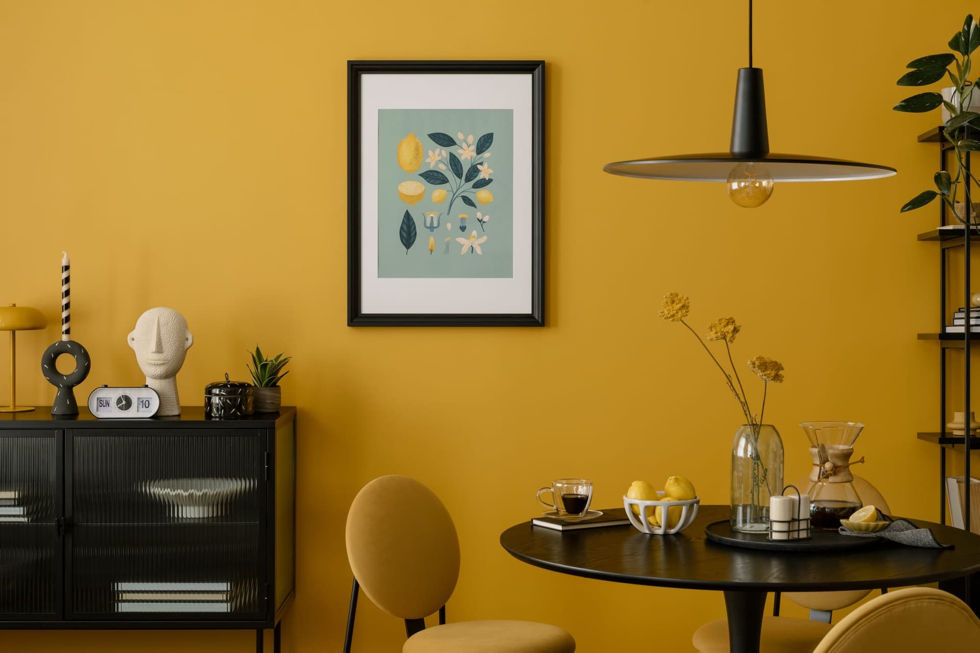
Consider the practical elements that influence your color choices: room size, natural lighting patterns, artificial lighting sources, and how many people typically use the space. A cozy den might benefit from rich, enveloping tones that encourage intimate conversation, while a home office could come alive with energizing hues that boost creativity and focus. Beyond “pop-psychology” and trends, each element should be explored with intention, helping you frame design decisions that serve both function and beauty.

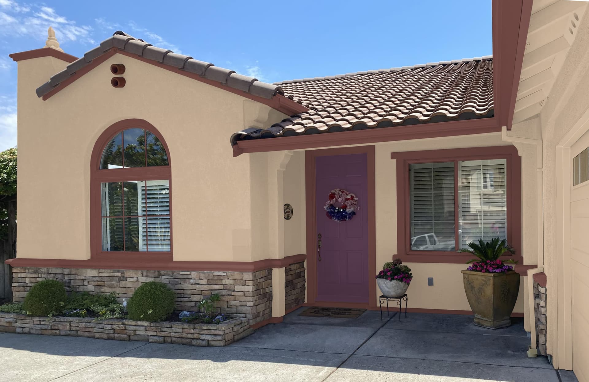
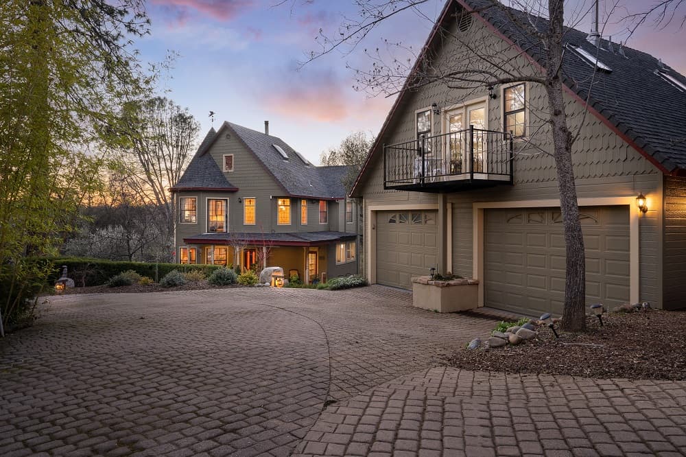
One of many color concepts developed by Barbara for this California home.
SUBSCRIBE TO THE HAVEN MAILING LIST
Curated homes, market intelligence and design stories — a few emails a month.
No spam. Unsubscribe any time.
Moving Beyond Safe Neutrals
Moving beyond safe, subdued palettes, you can explore and experiment with stronger hues that still feel elegant and timeless. Color isn’t about chaos—it’s about character. Just as a recipe benefits from thoughtful seasoning, a home benefits from nuance and depth that reflects the personalities of those who live there.

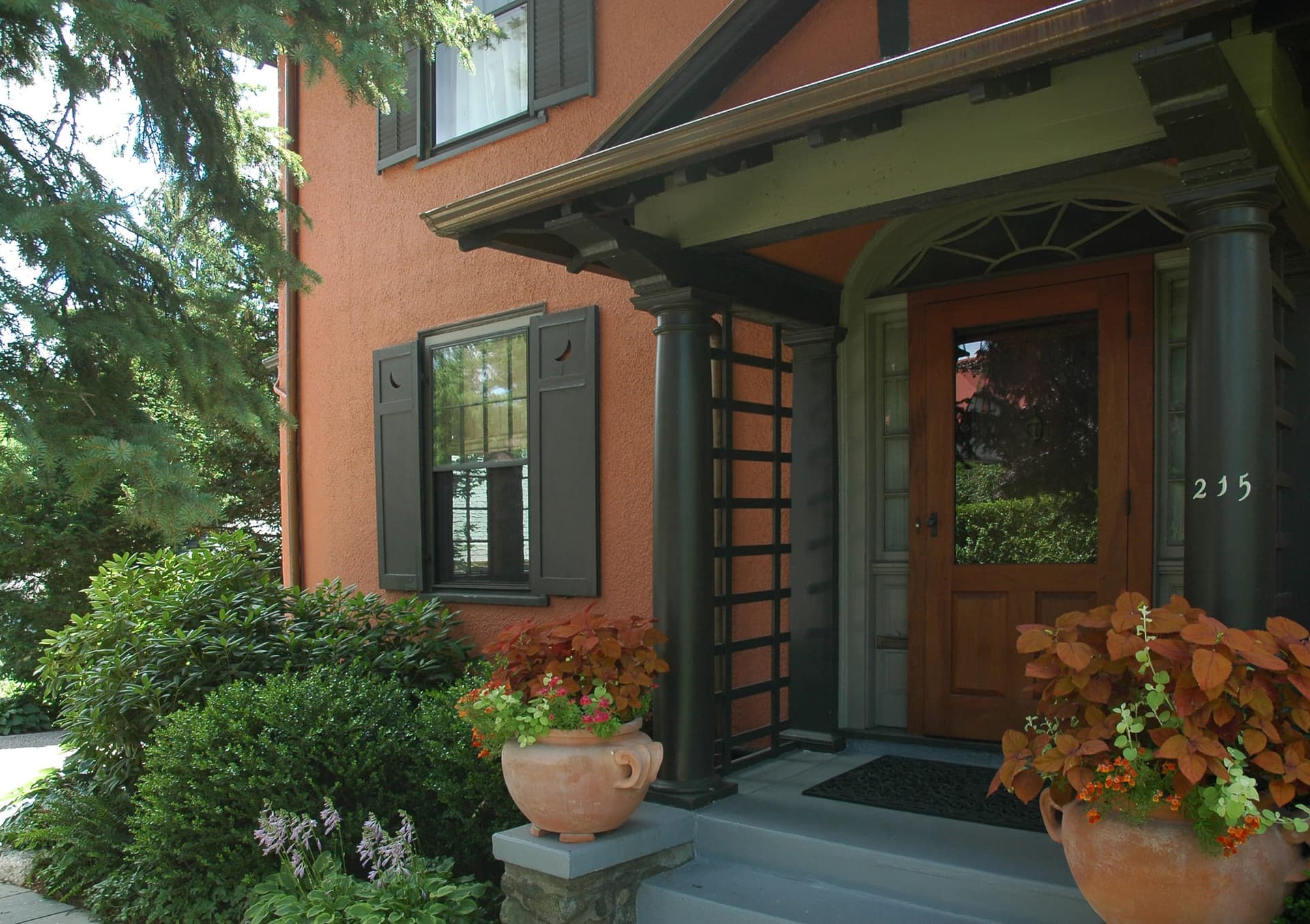
Color design by Barbara Jacobs for this historic Arts and Crafts home.
Rich tones inspired by nature offer endless possibilities for both energizing and soothing effects. Deep forest greens can create a sense of grounding and tranquility, while sun-warmed golds bring optimism and warmth to any space. Even bold combinations like sophisticated pink-and-red pairings can work beautifully when applied with confidence and restraint. The secret lies in understanding how these colors interact with your specific lighting conditions and existing furnishings.
The Art of Color Sampling
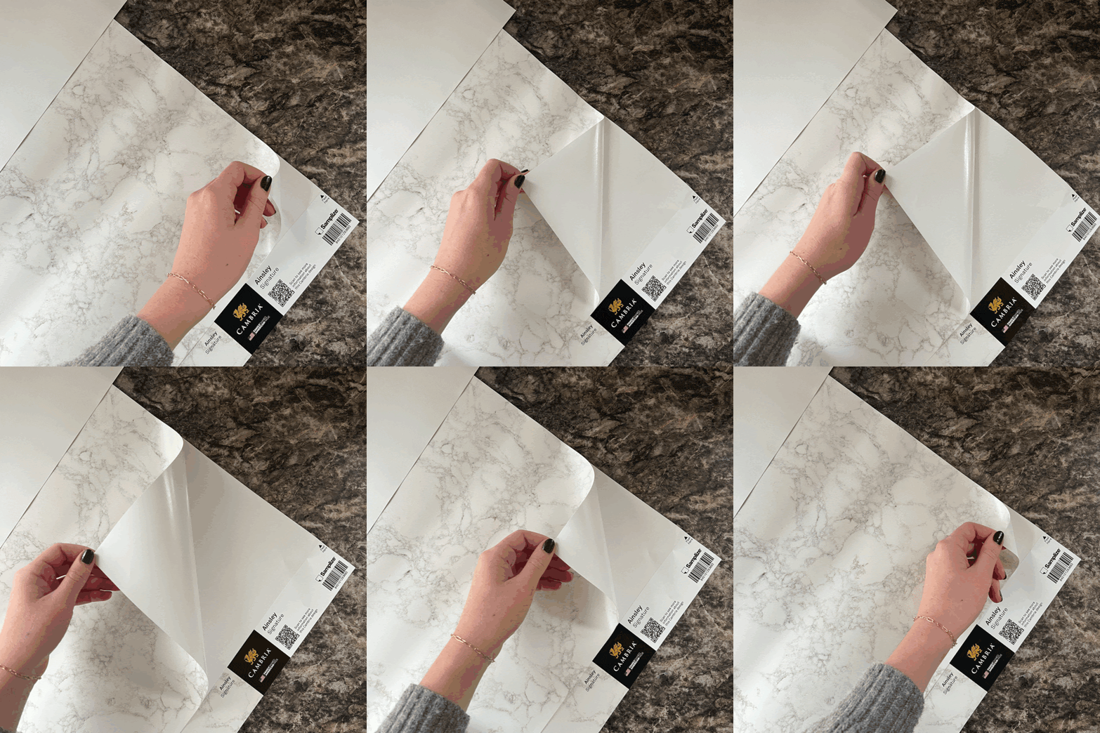
Sampling color stands as perhaps the most essential step in any successful color transformation. The difference between a color chip under fluorescent store lighting and that same hue on your wall at sunset can be dramatic. Whether you choose to paint test patches directly on your walls or order repositionable sample sheets—like those available through curated Samplize collections—the investment in proper sampling will save both time and disappointment.

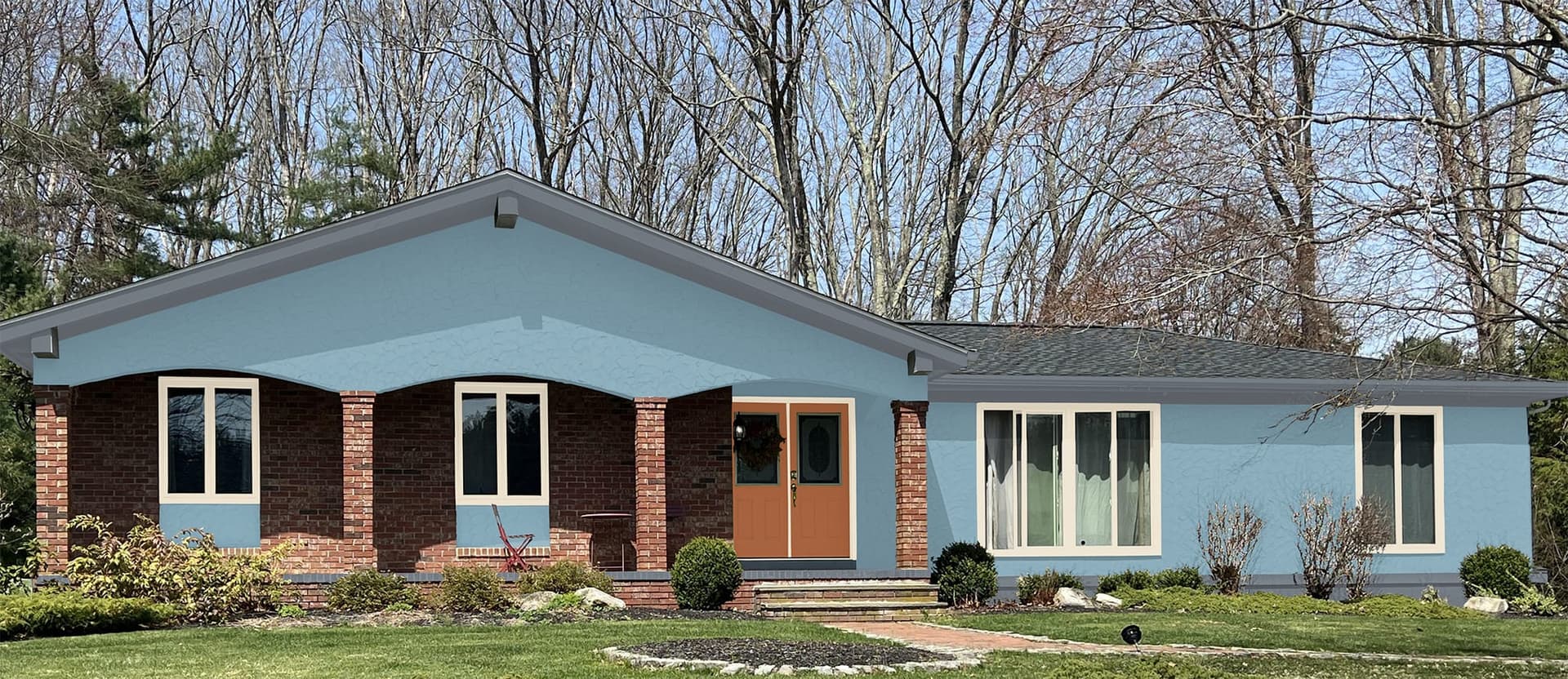
New Blues by Barbara for this Rhode Island ranch style home.
It’s important to view potential colors in your actual space, under your specific lighting conditions, and at different times of day. A detail that’s so easily overlooked in the excitement of trying new colors is our tendency to view color samples as if holding a book. Unless you’re wanting to paint your floor, remember to hold any color samples — even small ones–at the angle they will be applied to walls, ceilings, and adjacent rooms. Morning light reveals different qualities than afternoon sun or evening lamplight. This process allows you to see how colors interact with your existing furnishings, flooring, and architectural details before making final commitments.
Extending Color Beyond Interior Walls
Don’t limit your spring refresh to interior spaces. Exterior environments offer equally exciting opportunities for color exploration. Front doors, shutters, outdoor furniture, and even garden structures can benefit from thoughtful color choices that complement your home’s architecture while expressing your personal style. Consider how your exterior color palette connects with the surrounding landscape and neighborhood character.
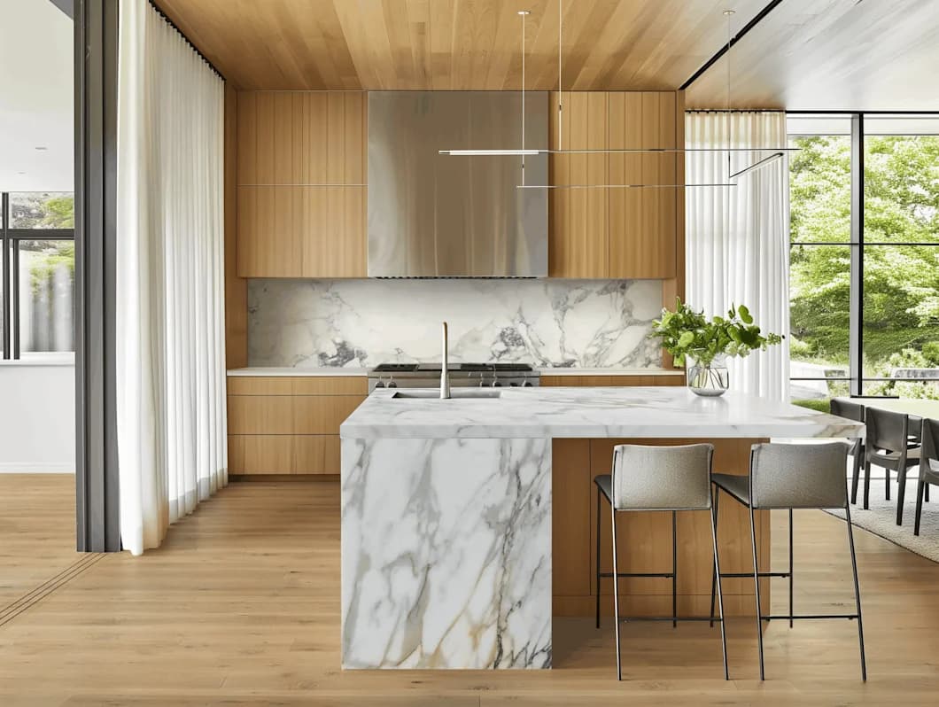
Wouldn’t you love to get 17″ x 34″ countertop design samples? Here’s the latest way to do it!

Professional Guidance and Resources
For those ready to explore color possibilities more deeply, professional resources can provide invaluable support. Barbara Jacobs offers personalized guidance, color consultation services, visualization tools and resources such as DesignShop that help translate inspiration into reality. These resources bridge the gap between dreaming about change and confidently implementing it.


One of the many color concepts Barbara designed for this contemporary California home.
Embracing Seasonal Connection
This spring-to-summer transition reminds us that seasonal décor isn’t simply about change—it’s about connection. Connection to the natural rhythms around us, to the people who share our spaces, and to our own evolving sense of home. When we choose colors that reflect our authentic selves while honoring the function and flow of our daily lives, we create environments that truly support and inspire us.
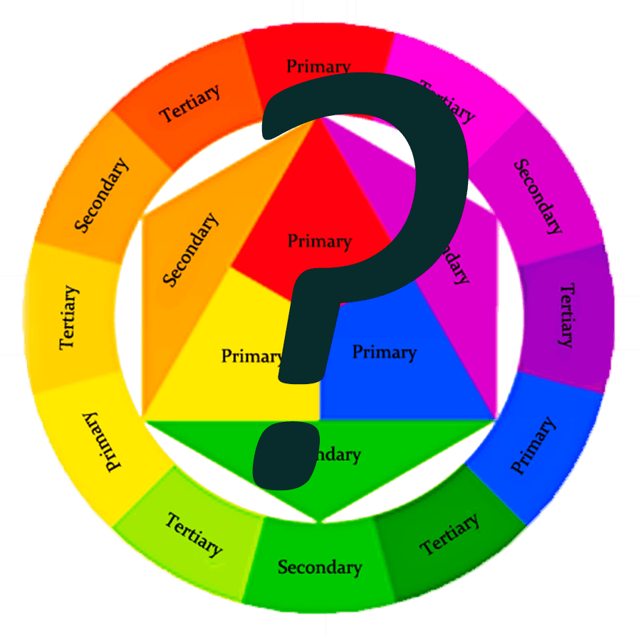
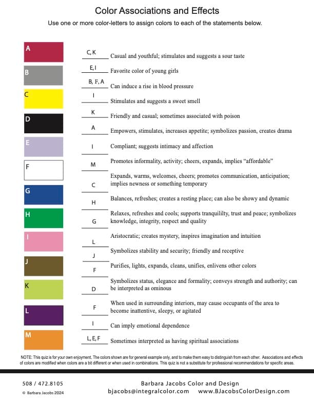
For more inspiration and resources, including color sampling options, design consultation services, and seasonal decorating ideas, visit the Barbara Jacobs Color and Design website. And view the latest blog post here about using dark colors in your home. Also, check out the little quiz below (that includes answers) to enjoy thinking about effects and associations of colors.
Make your selections of your favorite design and decor materials, and get samples delivered to your home here!